SmartSort for Gmail
Less Clutter, More Clarity
Research Goal : Understand how remote account managers handle email workflows and identify pain points in Gmail’s task management and prioritization. By interviewing real users, we uncovered key inefficiencies that impact productivity
Project Type |
UX Case Study
COGS 127 - Data-Driven UX/Product Design
Figma, Framer, Google Docs, and Zoom
UX Design, Researcher
4 weeks
Karla A.
Luis P.
Glenn H.
The original Gmail interface wasn’t optimized for task prioritization or workflow clarity, especially for remote account managers juggling multiple clients. Users struggled to keep track of action items due to cluttered layouts and poor visual hierarchy. Our goal was to simplify the experience by introducing clearer navigation, reducing cognitive overload, and designing a system that helps users quickly find and act on what matters most.
Through usability testing and peer feedback, users found the redesigned Gmail experience significantly more intuitive and easier to navigate. The new layout reduced cognitive load and made it easier to manage tasks across multiple accounts. Test participants especially appreciated the clear structure, improved prioritization, and modern visual hierarchy. Overall, the redesign enhanced confidence in completing everyday tasks efficiently.
35%
Improved task clarity during onboarding
25%
Faster task completion in prototype testing
84%
Positive Feedback on layout clarity and visual hierarchy

Process
Research & Analysis:
We interviewed remote account managers and educators to understand their email workflows, focusing on task prioritization, organization, and follow-up habits. We also reviewed competitor tools like Outlook and Google Classroom to identify key usability gaps in Gmail.
Personas & Problem Framing:
Our primary persona was a remote account manager who relies on structured organization, follow-ups, and task tracking. We identified pain points such as Gmail’s lack of built-in reminders, visual priority cues, and deadline tracking all of which negatively impacted productivity.
Information Architecture:
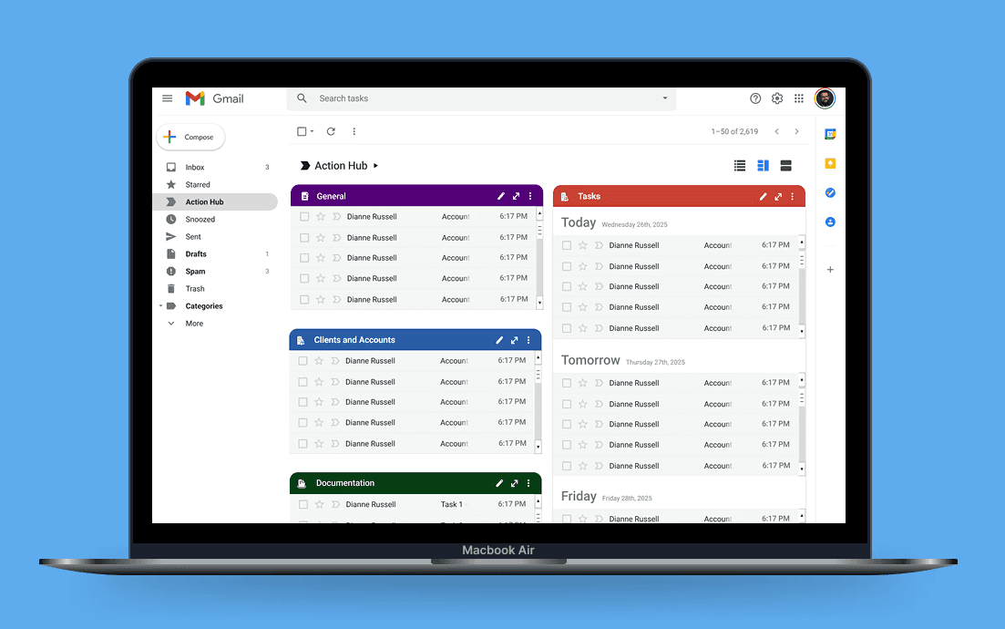
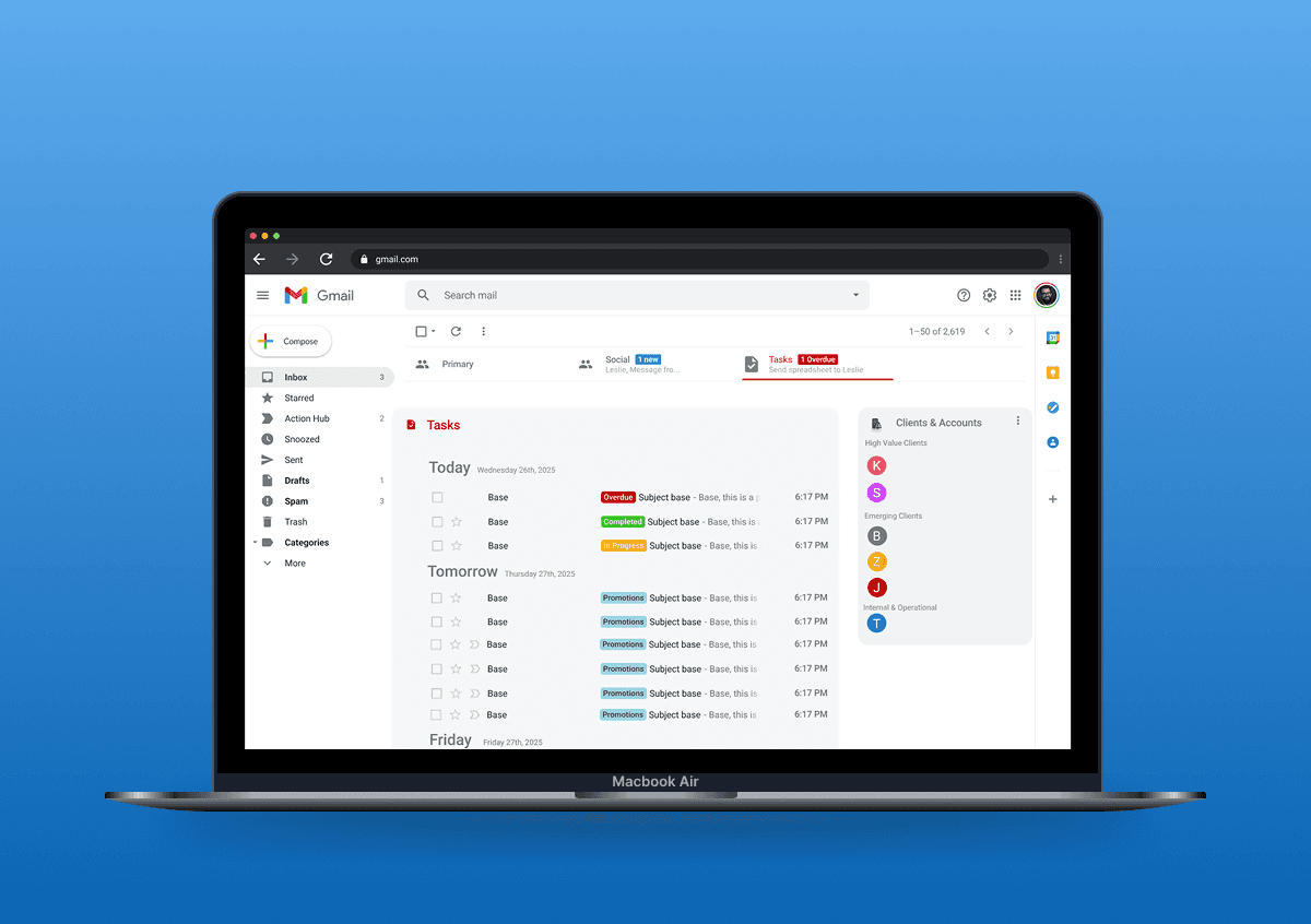
We restructured Gmail’s interface by introducing a dedicated “Action Hub” and clearer task categories (e.g., Important, Tasks, Projects) to reduce clutter and help users quickly locate critical emails.
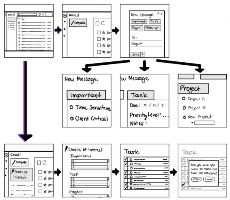
Wireframing & UX Flows:
We explored two distinct UX flows one focused on tagging and organization, the other on dedicated task management. These helped users mark emails, track progress, and assign priority levels through custom labels.
Usability Testing:
We tested two prototypes with participants. Feedback revealed that users preferred collapsible label systems, clearer visual hierarchy, and confirmation interactions. Flow 1 was favored for its clarity and reduced cognitive load.
Design Iteration & Visual System:
Based on feedback, we refined the layout, added a confirmation state, and introduced color-coded tags for urgency. We also created a visual design system to ensure consistency across interactions and improve overall navigation
Key Features
Task Tab Integration
Action Hub Sidebar
Quick Task Creation
Priority Tag System
Due Date Selection
Task Detail Panel
Visual Hierarchy & Layout Clarity
Label Collapse & Filtering
Seamless Gmail Integration
Custom Categories & Delegation
Grouped Email Preview by Client
Due Date Selection
+ More
“If this existed in Gmail today, I’d ditch Outlook immediately.”

Mr. Williams
— Remote Account Manager, Usability Testing Participant

Conclusion
The SmartSort redesign transformed Gmail from a cluttered communication tool into a streamlined productivity hub for remote professionals. By focusing on real stakeholder pain points like poor prioritization, scattered tasks, and cognitive overload. We introduced features such as the Action Hub, Task Tab, urgency labels, and media-linked task flows. Through iterative design and usability testing, we saw clear improvements in task clarity, completion speed, and user confidence. This project demonstrates how user-centered design can reshape even the most familiar platforms, proving that small, thoughtful changes can lead to major productivity gains