Designing a Mobile Inventory App for Real Kitchens
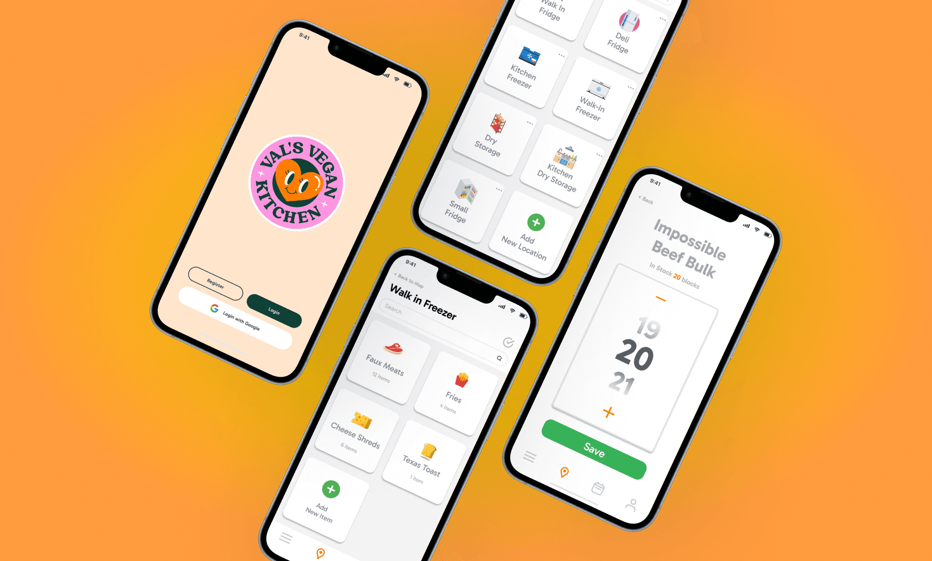
We created a mobile-first inventory system tailored for Val’s Vegan Kitchen, helping kitchen staff track and update stock by storage location. The design streamlines daily operations with features like quantity editing, item search, location mapping, and an activity log empowering staff to manage inventory faster and with fewer errors.
Academic Project for a Real Restaurant Client - Val’s Vegan Kitchen
COGS 187A - Usability and Information Architecture
Google Docs, Figma, Google Sheets
UX Designer
Heidi S.
Cecilia L.
Elaine S.
Challenge
Our mobile app improved inventory visibility and user workflows, enabling staff to update quantities, track item locations, and identify low-stock items with ease. User testing showed an 85% usability score and 70% user retention, with staff noting faster task completion and better control over inventory management.
85%
Task Success Rate During Usability Tetsting
70%
User Retention Across Kitchen Staff Roles
60%
Reduction in Inventory Update Time
Process
User Research & Pain Point Discovery
We conducted initial usability tests with restaurant staff to uncover core challenges in their inventory workflow. Feedback revealed issues with navigation, item visibility, and the overall complexity of updating stock. This guided our direction for a more intuitive, efficient solution.
Information Architecture & Feature Prioritization
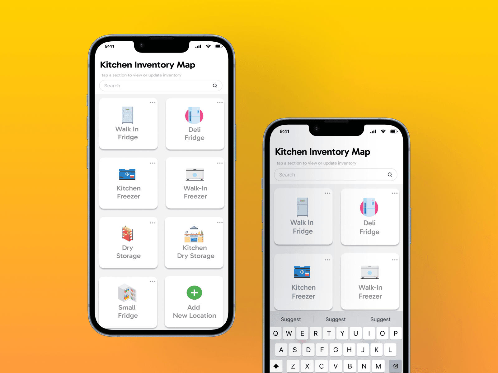
Using the insights gathered, we restructured the inventory system into clear categories (Walk-in Freezer, Fridge, Pantry) and introduced map-based navigation. We prioritized quick access, visual clarity, and minimizing the steps required to update quantities.
Wireframing & Prototyping
Our team designed low-fidelity wireframes to visualize new user flows and key features like category-based organization, batch editing, and quantity adjustment. After multiple rounds of critique and feedback, we developed high-fidelity prototypes in Figma for testing and presentation.
Usability Testing & Iteration
We tested our prototype with 3 users across 4 key scenarios. Their feedback informed UI and UX refinements including icon consistency, clearer action buttons, and simplified navigation. These changes significantly improved task completion and overall user satisfaction.
Visual Design & Branding
To enhance usability and reduce cognitive load, we implemented a clean, modern visual language with bold iconography, consistent spacing, and color-coded inventory sections. The final design aligned with the restaurant's brand while staying functional and scalable
Key Features
Location-Based Inventory View
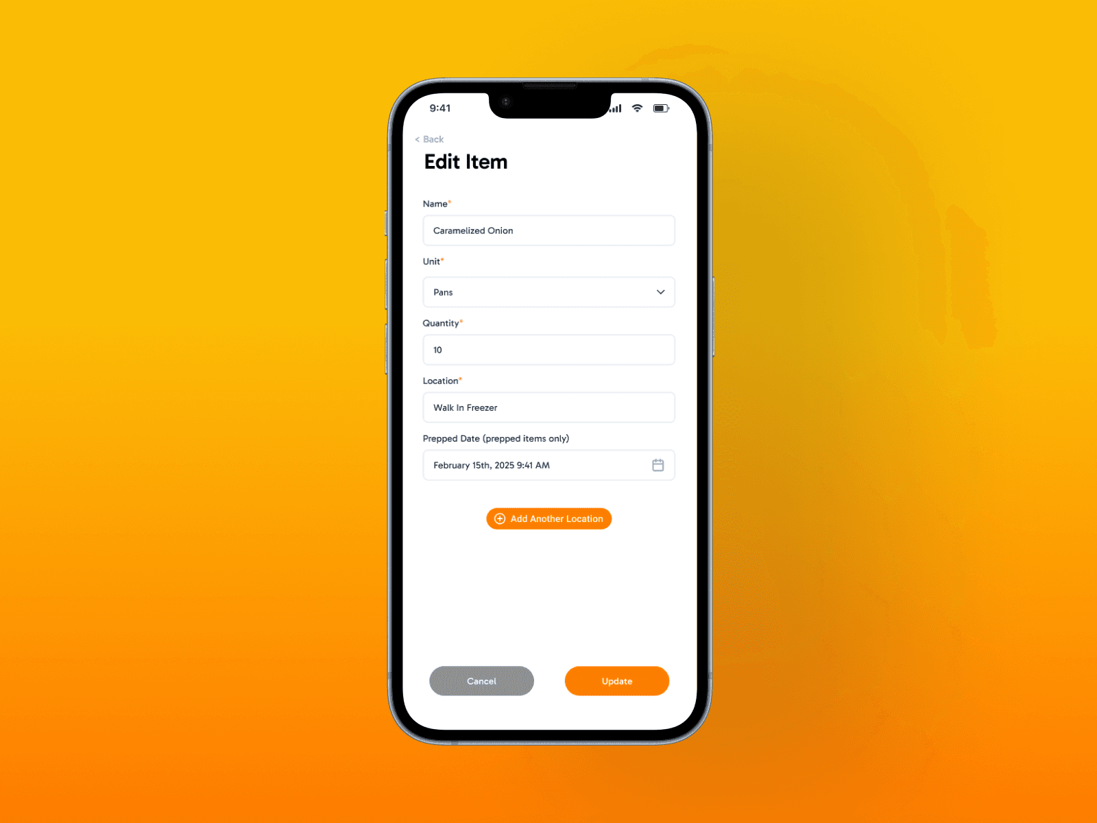
Quick Quantity Adjustment
Multi-Location Item Tracking
Multi-Location Item Tracking
Search & Filter Functionality
Add & Remove Items or Locations
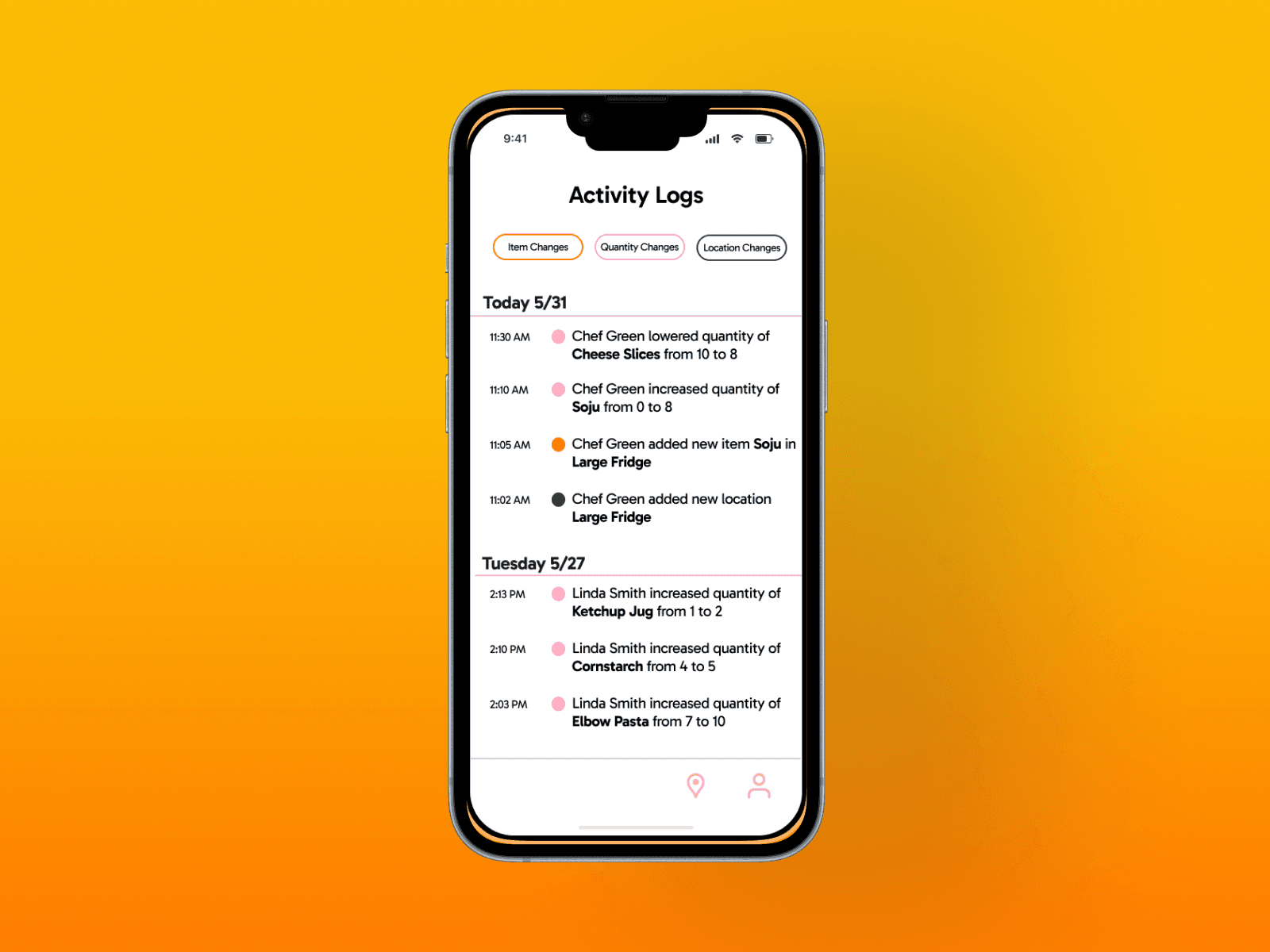
Prep Date & Activity Logs
Low Stock Alerts
Item Detail Cards
Role-Based Access Awareness
Mobile-First Responsive Design
+ More
“The interface is really clean and intuitive. I loved how everything was clearly labeled and the visuals made it easy to find what I needed without second guessing.

Janet S.
User Tester
Conclusion
Our redesigned inventory management app delivers essential features tailored to the needs of restaurant staff, streamlining navigation, organization, and item tracking. While the current version meets the core requirements, there's still room for growth. Moving forward, we plan to refine the visual style for stronger consistency, improve spacing and layout alignment, and conduct further user testing to identify any confusing or unnecessary elements. We’re also exploring new ways to structure information for a cleaner experience and ensuring the design remains accessible across various screen sizes including future tablet adaptation. These next steps will help us continue enhancing usability and scalability.